Archive for April, 2008

Stop dissing Wikipedia

30/04/08

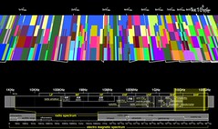
Graph from Matthijs den Besten‘s talk “Wikipedia: the organizational capabilities of a peer production effort”

Yesterday a digital media pundit told me that in a few years time “all the articles on Wikipedia will be locked down”. I was bemused, especially since I was using Wikipedia as an example of what can be achieved by mass consensus, in contrast to authoritative or editorial voices. I seem to be encountering more and more Wikipedia naysayers. I can understand why this might come from people invested in older styles of knowledge gleaning, but why would media pundits think this? It might just be iconoclastic tendencies, or a desire to stand out by criticising something we all love.

Personally I haven’t made many edits to Wikipedia. I have made some, from correcting grammar on the Eminem page through to adding a mnemonic to the page on the OSI seven layer network model, but even fewer have survived. In any case I use Wikipedia daily and love it. I’m not saying Wikipedia is perfect. There are articles where including all sides of a debate feels odd. For example, I gave a talk about social computing at an IWF board meeting in May 2005 where I compared the entries about pedophilia in Encarta  (which may require a subscription) and Wikipedia. The Wikipedia article included a list of organisations advocating pedophilia, the Encarta article did not. But even that criticism is lessened if one reads the current version of the Wikipedia article, where references to pedophilia advocates have been moved to a separate article.

The graph at the head of this post is the other Wikipedia analysis that bothered me, though it is clearly not as crass as the “all the articles on Wikipedia will be locked down” quote. In his talk titled “‘Wikipedia: the organizational capabilities of a peer production effort” at the recent OxIS / Ofcom Social Networking Conference Matthijs den Besten used that graph to show how Wikipedia is getting more bureaucratic, more businesslike. But does it show that? It certainly seems to; but let’s factor the the size of Wikipedia into den Besten’s graph. We know the numbers of administrators over time and the number of articles over time so we can look at the number of administrators per article. This seems to go from 0.000526 (i.e. 40/76,000) at the end of the third quarter of 2002, down to 0.000191 (i.e. 1013/5,300,000) at the end of the third quarter 2006. So the out-of-control increase in the number of administrators presented by den Besten is in fact a decrease of over 50% in the number of administrators per article.

I guess the strapline for this post is ‘don’t believe the naysayers’.

links for 2008-04-30

30/04/08

Project Idea: Arduino Sous-vide Cookery

28/04/08


“Sous Vide Machinery” by
Ginger Gross

We’ve been glued to the BBC 2 series The Great British Menu We came across it during the week where Sat Bains and Glynn Purnell fought it out to represent the Midlands. They both used a strange cooking technique that I had not encountered before whereby meat is vacuum sealed in a plastic bag and then cooked for a very long time in a water bath at a constant surprisingly low temperature. The results seemed amazing. I asked Fabien (a knowledgeable food-loving colleague at work) and he pointed me to the whole new word of sous-vide cookery. I haven’t yet explored the cost of a large water-bath (or a vacuum packing machine) but it did strike me that this may be a great project to try on the Arduino, and I found an example water-bath electronics project online that may help.

links for 2008-04-26

26/04/08

Assam tea – the elixir of the Gods

25/04/08

I love tea. When we lived out near Seattle I tried swapping to coffee but while it is a good drink it left me feeling unwell. Kate and I drink a lot of tea, I get out of bed every morning and make us each a giant mug which we drink in bed while we chat through the coming day.

Back when I was much younger, and Kate and I were dating, we use to pop up to London at the weekend and stop in The Tea House in Covent Garden (it’s still there) to stock up on different teas. Our favourite was black cherry flavoured (they don’t seem to do this one any more 😦 ) Then in the week, after SEEVIC, Luke Stoneham and I would walk home and sample various brews. I’m not sure I remember this correctly, but I think our favourite was Formosa Oolong, though we were partial to a nice Lapsang Souchong too.

Now I’m much older (42 not 17) and I find my favourite is Assam. The one pictured at the head of this post is from The Tea House in Covent Garden again, Will and I picked it up before Carmen at the RoH. It’s their posh one: 2nd Flush. Excuse the bits floating on the surface, visible in the photo, I’d refreshed the pot with more boiling water – the first cup looked much better. Assam is amazing. It is a robust tea, best drunk (I think) alongside food. It has real subtlety and can stand up alongside anything from a thin slice of Madeira Cake through to egg and chips. The revelation for me came supping a cup at The Alpine Coffee Shop in Betws-y-Coed. Don’t be fooled by the name, their teas are amazing. And don’t be fooled by the look of the place either. It looks like a friendly, clean, but functional cafe for tourists and hikers to get a cheap bite to eat. But it is more than that. Throughout my childhood whenever we went on holiday Mum and Dad would take us to umpteen tea shops, and it’s a habit I’ve kept alive. So I do know my tea shops. But I wasn’t prepared for just how exquisite the single estate Assam that they serve is. I jotted down the details so I could hunt it out but they’ve fallen out of my wallet long ago. Amazingly (it has nothing added save milk) you can taste lychee underneath the tea flavour. Do go to The Alpine Coffee Shop if you find yourself in Betws-y-Coed, and keep ordering their posh Assam!

Project idea: visualizing radio frequency whitespace with ferrofluids

24/04/08


Old seeping oil
by dumbledad

A few years ago we did some interesting work on using part of the DAB radio network in the UK for datacasting – i.e. for sending non radio content like video files or emergency procedures to mobile devices. Several of the people involved in that project have gone on to think hard about whitespaces i.e. what can we enable in the areas of the radio-frequency spectrum that are unlicensed or unused. Recently Gary Tonge and Pierre de Vries wrote a piece for Communications & Strategies (no. 67, 3rd quarter 2007) called “The Role of Licence-Exemption in Spectrum Reform”

Motivating countries to allow licence exempt spectrum is a difficult but an important debate. The difficulty is that the argument rests on the idea that licence exempt spectrum will encourage innovation, and unexpected successes (like wi-fi) will flourish. Of course it is hard to map out the unexpected.

Another problem is that people’s understanding of radio spectrum use and its actual use differs. Consider these two interesting visualizations of radio frequency.

First off I picked up http://spectrumatlas.org/ by http://www.bestiario.org/ from Richard’s trends blog. It’s a 3d visualization of the RF spectrum, an atlas of electromagnetic space. Using it you are left with the impression that the RF spectrum is jam packed with legitimate and useful services. So let’s instead look at a radio frequency spectrogram that I first encountered in an earlier paper by Gary Tonge. It’s taken from an Ofcom consultation document in their 2004/2005 spectrum framework review: “Spectrum Framework Review: A consultation on Ofcom’s views as to how radio spectrum should be managed

The key may be difficult to read, but the blue parts of the graph are spectrum not in use at the time the frequency was scanned. This scan was done over a twenty four hour period in Baldock (near where I live) in 2004. It tells a very different story form the previous visualization.

The Ofcom spectrogram is a very clear way to see how much of the radio frequency spectrum was not being used during that day. I’ve been wondering if this might be a fun thing to visualize using ferrofluids – hence the oily picture at the top of this post. Some of the more hardware savvy people in our team at work have been starting to think about ferrofluids and I’ve been on the look out for an application. One magical thing about ferrofluids is that they make something invisible shockingly visible. Normally they just look like oil but when a magnet is held underneath they adopt physical shapes dependent on the magnetic field. There are some awesome videos on YouTube and some lovely photos on flickr like this one from David Nicholai:

So perhaps this could be used to visualise the invisible radio frequency spectrum. I imagine using a small pump, beam, and sump to produce a sheet of oily ferrofluid over a sheet of plastic or glass. Behind the glass we could use Phidgets or an Arduino to drive magnets mounted on a motorised linear potentiometer. This would then result in elements of the graph being rendered as lumps in the otherwise sheer sheet of oil, which I imagine would look amazing. Interesting? Mad? Comments please.

links for 2008-04-24

24/04/08

Wonderful images from Kyle Bean

16/04/08

Ever since encountering the slide deck Tom Coates used for a talk he gave at SF06 I’ve been besotted by his slide’s style. He bases each on a flickr photo with a simple short text on a colourful background on top. Check out Tom’s deck to see what I mean: http://www.plasticbag.org/files/greater/Greater than the sum of its parts.pdf Since I first saw them I’ve used the style exclusively, and other than a complete misunderstanding on my part of ‘creative commons’ it has worked really well. It also means that I’m always on the look out for images that sum-up something we’re doing. Flickr‘s a great resource, as is ffffound (though ffffound isn’t always work-safe), and this morning I saw this great work from Kyle Bean that are a humorous take on the relationship between paper and digital.

Two new book visualizations

14/04/08

Since my recent post on work providing abstract computer rendered visualizations of biblical texts I’ve noticed are two more book visualizations, though this time neither are done on the bible. I came across them both in Andrew Vande Moere‘s amazing Information Aesthetics blog.

The first is Stefanie Posavec‘s On The Map, now showing as part of the On The Map exhibition at Sheffield’s Millennium Galleries. Stefanie’s visualizations are discussed and photographed on http://www.notcot.com/archives/2008/04/stefanie_posave.php and look very beautiful. Like Linda Becker she is a graduate of Central Saint Martins – they are clearly covering some fascinating stuff there. The sentence drawing are amazing and I cannot wait to get up to Sheffield and see them in full size and work out how they are constructed and how to read them. I should really have used one of the great photos of Stephanie’s visualizations on NOTCOT but I choose instead their picture of her copy of On The Road since that really shows the painstaking work that must have gone into this, and hints that she did the work through detailed reading rather than computer based statistical analysis (though that cannot be true).

The second is by Tim Walter and I think it forms his diploma project (I’m not sure how that maps on to the education system in England or the USA). It’s called Textour and as an example text Tim renders President Bush’s speech announcing the war against Iraq. There are similarities with the visualizations I mentioned before (especially with TextArc) but one thing Tim does very differently is that his visualization really does rely on animation. The still shots on his site are interesting – but you need to watch through the video to get a sense of how it works.

I’m getting excited about Linda Becker‘s forthcoming internship with me at Microsoft Research in Cambridge – this niche field of book visualization seems to be one that is generating more and more examples of interesting projects.

Indirection in computer science and theology

14/04/08

? key

Originally uploaded by _gir_

Two ‘religion’ posts in a row. Hmmm. A little odd for an atheist.

Over the coffee machine last week I was chatting with Toby about another local Alpha Group discussion. One of the big problems with being an atheist (IMHO) is that my answer to the big questions, especially “Why are we here?”, seem inadequate (though true). In answer to “Why are we here?” I’d have to say that there isn’t really a ‘why’, we are here by accident, just as the result of a long series of often chance events. Clearly that answer doesn’t even feel of the same ilk as the question. So I am intrigued by how religious people answer the same question: “Why are we here?” When this discussion came up in our local Hardwick men’s Alpha Course I pointed out that the response I’ve often heard from Christians (“We are here to serve God”) isn’t really adequate – it is more a slight of hand. Any being with enough sentience to form the question will eventually ask “Why am I here?” So by answering that we are here to serve God all we have done is moved the question up a level. We are left wondering what God answers to the question “Why am I here?”. All we have done is added a level of indirection.

Toby’s response to that was fascinating. He can’t recall the conversation now but I was left perplexed when he pointed out that most of the hard questions in computer science are solved by adding a level of indirection, so surely I should be comfortable with that technique here. What a great retort. I’m now left wondering what is the class of problems, in computer science and beyond, that is helped with indirection. And importantly is the question “Why are we here?” one of those problems. At face value it isn’t. Surely it is easier to analyse the reasons for our own existence than the reasons for God’s existence. We have day-to-day experience of existing as people that should help us to intuit an answer. But perhaps that’s the point. By moving the problem up to a level that is more likely to be beyond our comprehension it helps us to let go of the problem.