-
Great taxonomy of quadrilaterals for when your kids say “Dad, what’s a trapezium?”
Archive for June, 2008
links for 2008-06-30
30/06/08Quick rant about calling a ‘language’ “Processing”
29/06/08
“437 scientific potatoes” from yesyesnono – (?)
I’m just deciding whether to use Processing or the Windows Presentation Foundation (WPF) for my book visualization (bookviz) project with Linda. The advantages of us using WPF are that:
- I’ve already got some familiarity;
- It’s a part of a fully fledged programming language so I can hone performance, robustness, etc;
- I know how to glue in data sources;
- There’s a good integration story with the design tool Expression Blend (which Gavin, Nic, and I have been using); and
- There’s the potential to webalize the resulting application via Silverlight.
But there’s one big disadvantage. WPF is part of C# and the .Net Framework and learning that is well beyond the scope of a twelve week internship for a designer (don’t ask Richard about forcing designers to use object oriented languages unless you have your asbestos suit on!) So if we go the WPF route then all the code will be written by me. That’ll be fun but it may prove a bottleneck, and in would be less fun than writing code together.
Enter Processing. Processing is a ‘language’ designed by Ben Fry and Casey Reas when they were both in the Aesthetics and Computation Group at the MIT Media Lab. I think that it wasn’t always called “Processing” but use to have the cutesy hacker spelling “Proce55ing”. More on that later. I’ve put “language” in single quotation marks (single inverted commas) because what is interesting about Processing isn’t the language syntax, it’s just a cut down version of Java, but the API and the environment. The advantages of us using Processing are that:
- Ben Fry and Casey Reas designed the language so that it would be easy (or easier) for designers to use as a “software sketchbook”, so we could potentially share coding tasks;
- There’s a buzz about Processing, especially amongst the information aesthetics community (the designy end of information visualization);
- Other people at work have been playing with it; and
- The visualizations produced in Processing, like the one that heads this post, are often beautiful and subtle.
But like many information visualization projects our bookviz work is information intensive, and so will make extensive use of SQL queries and a SQL Server 2008 database. Hence I need to get whatever we choose running against SQL. If we go the WPF route I have an embarrassment of riches (and acronyms 😉 ). I could use ADO.Net, OLE DB, Windows DAC, LINQ, … But if I choose Processing what should I use? The obvious way to find out is to check the Processing site: http://www.google.com/search?hl=en&as_q=SQL&as_sitesearch=processing.org Only that search reveals that most Procesing integration with SQL is to MySQL not Microsoft SQL Server. Never mind I can just search the SQL Server discussion groups.
Now I am stuck. Of course the search http://groups.google.co.uk/group/microsoft.public.sqlserver.programming/search?hl=en&group=microsoft.public.sqlserver.programming&q=processing returns over 10,000 results, but how do I distinguish those that use the word “processing” as a verb from those that use it as a noun? If it had a curious spelling, like “Proce55ing”, the job would be easy. As it is I cannot search outside the Processing site itself because (obviously) the word “processing” is already heavily used on programming discussion boards! Arghhhhh.
It reminds me of the early days of C# when Google searches were made difficult because Google would drop the “#” from the search term and return lots of results about the C language. In the unlikely event that I ever invent a language I’ll make darn sure that it is easy to search for. That does remind me of my favourite language name. Years ago we were musing about object oriented languages over lunch when Paul Sanders’ wife (sorry – senior moment on her name) suggested that the object oriented version of COBOL ought to be called “ADD 1 TO COBOL” 😉 (N.B. Wow – that joke has even make it to Wikipedia’s COBOL page!)
NB Before signing off this post I just want to record one other apprehension about Processing: the way it handles fonts. Rather than render fonts dynamically one first loads the fonts into the Processing environment so that each each letter of the alphabet is stored as an image. Is that right? I need to think about that. What happens to kerning? What about tiny font size? Can one use font of fractional size? What would 0.55 point font look like? What size font does Brad Paley use around the outer ellipse of TextArc? In one of the processing books Reas and Fry cite LettError‘s Beowolf font, which prints each letter differently every time the letter is printed. How does that square with preloading fonts as character images? Too many questions 😦
links for 2008-06-28
28/06/08-
Fabulous short post about paper prototyping including the wonderfully zen original sketch for twitter.
Central Saint Martins College of Art and Design: Degree Show 2008
24/06/08We’re in degree show season again and last Monday Kevin and I went down to see the Central Saint Martin‘s work, and in particular the degree show from the MA in Communication Design.
I was a bit apprehensive about taking an afternoon out to see the show – I’d enjoyed it so much last year I thought my expectations may be too high, but I was delighted again. Here’s a brief summary of what I found.
- The fascination with visualization continues. I saw work visualizing body shape, books, invasions, deaths, clutter, radio transmissions, news, etc. Lot’s to pick up on for my book visualization work and Richard’s network visualization work,
- Some themes emerged – especially visual ones. For example there was a real tension being played out between the old and the new. For example several projects produced artificially pixelated views, while others rendered onto sheets of rusty iron.
- Some things were notable by their absence. There was less screen based work than last year, and hardly any ‘physical computing’. And unlike the Dundee show, where Richard and I saw several surface computing projects, I didn’t see any surface work from CSM (though there is one project by Melanie Sayer on the website that I managed to miss)
There were lots of intriguing visualizations. One of them, David Hernández Méndez‘ map of the American Invasion of Mexico, paid homage to Minard’s famous visualization of Napoleon’s invasion of Russia.

Another looked at overcrowding and household clutter in the homes of refugees before they were re-housed. It’s a lovely piece of thought provoking work, and ties in with Alex’s work on clutter, but I felt the resulting images were too neat, too designed, to adequately sum up the squalor that I think Jamie Buswell was trying to document.

There were several works that might feed into our retired “Revealing the Invisible” theme. One that may prove particularly interesting for our thinking about radio frequency spectrum analysis was Seung-Yong Jung’s plots trying to visualize radio broadcasts across the UK showing broadcast strength and station popularity.

Seung-Yong also had some intriguing radial prints where each row of pixels was printed on a different concentric clear disk so that if one turned the disks the letters emerged and faded from legibility.

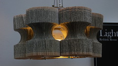
But my favourite work of revealing was from one of the Ceramics BA students, Judit Kollo. Judit had produced a wall hanging, built from textured slabs of porcelain. They looked good just as an abstract, their texture almost like a relief map.

But when you turned on the light behind them not only was the difference in thickness between different parts of the tiles revealed, but Judit had also drawn jellyfish on the reverse by pushing pinpricks almost through. Two of them are just about visible in this photo.

The book visualizations were interesting. One of the things Linda and I have been grappling with is how to make the visualization free-standing i.e. how do you include enough information in the design and in the key so that people can start to decode the visualization without needing the designer to explain it or without needing to read a manual. I’m not sure the ones I saw managed, though they were great in other ways.
Laura Sulivan‘s was an interesting series trying to analyse texts from the perspective of the visual principles of information design.

I was lucky enough to be there when Ebany Spencer presented her project to the current first years. Ebany had several visualizations of the story “Flatlands” which I knew as it’s a popular short story among mathematicians. There were several innovations in Ebany’s work. She’d used a stave-like notation where each stave represented a different world in the book. She’d also printed each stave as a foldout hardback book with slots cut in the top and bottom of the pages into which the other stave-books slotted. I also loved the way she’d folded out the paper to produce some 3D in her visualization.

Ebany also had a different goal for her work and a new inspiration from the other book visualizations I’ve encountered. One of her goals was to take a strong editorial role: she seemed not to just want to reveal new things about the structures in the Flatlands story, but also to use those structures to tell a story about the work. Taking inspiration from the marginalia of medaeval illuminated manuscripts was also interesting.
There were several other works in which paper was physically manipulated. Haein Song made “Books of the Absurd” where he attempted to “attain a sense of futility, whilst being immersed in a love of creation”.

In form, though not in motivation, Haein’s work reminded me of Lucy Norma‘s recycled book lightshades that Richard and I saw during last year’s New Designers.
Cutting at paper also figured in some designers projects. Daniela Silva used cut-outs to physically map the interior of the homes she’s lived in.

And Aysegul Turan’s All That Is Solid Melts Into Air was a more abstract look at change through cutting or rubbing through paper (which was also covered in patterns of ink or ash?)

Recycling and the environment received less attention than last year. I’m pleased about that, it’s an important subject but was receiving so much attention from young designers last year that it began to get repetitive. There were still some nice pieces, like Angela Morelli’s maps of global water usage.

Another theme from last year’s shows that had dwindled this year was CCTV. I did see one piece, by Joan Ayguadé Jarque on the BA in Product Design. He’d made a CCTV housing that subtly told people where it was looking, and provided a domed mirror so that people stood underneath it could use it for their own surveillance work.

There were two projects that might be of interest to those studying family collections of media. In one designer Sarah Roesink asked her parents to write down personal memories associated with particular photos and then she made them into elegant bound book. Sarah was on the photography side of the course but I thought her response to the need to individually honour old family memories and photographs was something for us to chew on.

From the opposite perspective Mayuko Sakisaka on the product design BA made a piece called Please keep my secrets, a secure (and beautiful) printer for printing and storing text messages from one’s boyfriend.

Storytelling was picked up again Aris Tsoutsas in his project On The Riverside. But this was almost the opposite of a digital project – the cover sheet was rendered onto a large sheet of rusty iron!

At the MA in Communications Design I was hoping to see more ‘physical computing’ than I did. That said the two projects that I did see with a strong ‘craft’ bent were two of my favourites of the whole day. In “Printed Matter” Evelin Kasikov had embroidered fonts and other design experiments onto card with cross-stitch. She had letters, colour charts, and pixelated phrases. The result was a wonderful evocation of the contrast between the digital and the slower crafts.

Robert Corish‘s “Audio & Visual Evolution” reminded me of several of our projects and was a real explosion of creativity. He had straightforward explorations of randomness that Tuck would have enjoyed

But at the heart of the project were two machines for generating abstract sound feedback loops. He’d used MaxMSP, Arduinos and a host of other stuff to great effect.

Robert was one of the few designers to include his commonplace book (or lab notebook, or day book, or whatever you call the notebooks we carry around) as part of his display and you can see why. His notes reminded me of Stuart’s or Richard’s, in fact he’s included his on his website, hinting towards the work Richard has done with his.

There was so much more I could write about. Definitely worth a visit next year. One project it would be awful to sign off without mentioning was Kacper Hamilton’s Deadly Glasses. Kacper made a wine glass to represent each of the deadly sins, for example the one on sloth had a tap on the bottom and a hanging chain so one could hang it up and lie under it to drink the huge glass, drop by drop. Lust had a frosted glass ball at the end of the hollow stem so that one could drink by licking the base of the glass. Very clever and beautifully executed.

Celebrate – I got a TtV in a "best of month" thread :-)
12/06/08
Back in 2004 a friend of mine, Rachel Jones from Instrata, took part in a UK government Technology Mission to the US looking at Future of User-Centred Design. When she got back she alerted me to two new services she’d seen (delicious and flickr) that she felt I’d enjoy because of the close links between their feature growth and the availability of their public APIs. Both recommendations proved valuable. Those who know me won’t be surprised that I quickly became obsessed with flickr. I started posting photos there in autumn 2005, but one of the joys of flickr is the groups: the community features are as exciting as the photo storage features. If you imagine a style of photography or a subject you enjoy photos of then you can bet that there is an active flickr group about it. Wonderful. My favourite group is the Through the Viewfinder group, though my route to finding it was convoluted. Another friend of mine (Matt Williams of ecru) mentioned that a designer he knew (Andy Gosling) was into a style of photography whereby one used a digital camera to take a photo “through” an old camera.

Since then one of my hobbies (should that read obsessions?) has been Through the Viewfinder (TtV) photography. There’s a great flickr group all about it, complete with links to detailed instructions on how to build your contraption (mine’s pictured above). It’s wonderfully experimental, with people trying new cameras, new subjects, new contraption constructions all the time. TtV is also growing in popularity, so much so that the group photo pool is difficult to keep up with. Hence they started regular “best of month” threads in the group’s discussions where people can post their favourites, as long as they are not posting their own work. I’ve long hoped to get one of my TtV pictures posted into a “best of the month” thread and in May I did. Alan organised a meeting at the The Møller Centre which is in Churchill College. I took the opportunity to take my TtV kit and spent some time afterwards taking shots on the roof, like this one.

But the real fun came after that. I knew that Churchill College Chapel had some John Piper (and Patrick Reyntiens?) stained glass and since I administer the Contemporary Stained Glass Windows group on flickr I was eager to go and photograph them. The chapel is locked, so I had to get a key from the porter, but it was well worth it. An understated, leaky, but beautiful modern chapel. And lo, one of my TtV shots of the Piper glass was posted by Friendly Joe to May’s “best of the month” thread. I’m sooooooo chuffed. Here it is.


