Archive for the ‘visualization’ Category

Loving the interweb’s serendipity

27/11/08

Daniel Levitin's "This Is Your Brain On Music" published by Atlantic Books

Don’t you just love the serendipity of the web? Two things have been on my mind recently:

  1. I joined the flickr 365 Days project where members take a self portrait every day for a year. Many use it to improve their photography or photoshopping skills. I’m treating it as an exercise in archiving and self exploration and presentation (i.e. I hope my efforts will be something I can look back on in later years as an interesting journal of how my year went aged 43/44).
  2. I’ve been reading “This is Your Brain on Music: Understanding a Human Obsession” by Daniel Levitin that Kate got me as a birthday present. I’m enjoying it, and I really like the cover which seems to combine paint splats to symbolise creativity, plant forms to symbolise beauty, a silhouette to reference the human brain, and data visualization like arcs to symbolise algorithmic complexity. It also seems to capture one of the current visual Zeitgeists I see in lots of design work.

So I’ve been looking out for ways to algorithmically draw a similar background so that I can make one of my daily portraits a similar silhouette. So I was excited this morning when my daily flick through ffffound unearthed this great piece of generative art:

'Cyl 0149 150x100' by Marius Watz

‘Cyl 0149 150×100’ by Marius Watz which lead in turn to his two amazing blogs. The first, Art from code – Generator.x, is all about “the current role of software and generative strategies in art and design” and looks like an amazing resource of news, inspiration, and code. The second CODE & FORM: COMPUTATIONAL AESTHETICS is a blog supporting Watz’s coding and teaching activities and contains tantalising entries like this recent round up of computational typography: http://workshop.evolutionzone.com/2008/11/18/exercise-computational-typography/

Quick rant about calling a ‘language’ “Processing”

29/06/08


“437 scientific potatoes”
from yesyesnono(?)

I’m just deciding whether to use Processing or the Windows Presentation Foundation (WPF) for my book visualization (bookviz) project with Linda. The advantages of us using WPF are that:

  1. I’ve already got some familiarity;
  2. It’s a part of a fully fledged programming language so I can hone performance, robustness, etc;
  3. I know how to glue in data sources;
  4. There’s a good integration story with the design tool Expression Blend (which Gavin, Nic, and I have been using); and
  5. There’s the potential to webalize the resulting application via Silverlight.

But there’s one big disadvantage. WPF is part of C# and the .Net Framework and learning that is well beyond the scope of a twelve week internship for a designer (don’t ask Richard about forcing designers to use object oriented languages unless you have your asbestos suit on!) So if we go the WPF route then all the code will be written by me. That’ll be fun but it may prove a bottleneck, and in would be less fun than writing code together.

Enter Processing. Processing is a ‘language’ designed by Ben Fry and Casey Reas when they were both in the Aesthetics and Computation Group at the MIT Media Lab. I think that it wasn’t always called “Processing” but use to have the cutesy hacker spelling “Proce55ing”. More on that later. I’ve put “language” in single quotation marks (single inverted commas) because what is interesting about Processing isn’t the language syntax, it’s just a cut down version of Java, but the API and the environment. The advantages of us using Processing are that:

  1. Ben Fry and Casey Reas designed the language so that it would be easy (or easier) for designers to use as a “software sketchbook”, so we could potentially share coding tasks;
  2. There’s a buzz about Processing, especially amongst the information aesthetics community (the designy end of information visualization);
  3. Other people at work have been playing with it; and
  4. The visualizations produced in Processing, like the one that heads this post, are often beautiful and subtle.

But like many information visualization projects our bookviz work is information intensive, and so will make extensive use of SQL queries and a SQL Server 2008 database. Hence I need to get whatever we choose running against SQL. If we go the WPF route I have an embarrassment of riches (and acronyms 😉 ). I could use ADO.Net, OLE DB, Windows DAC, LINQ, … But if I choose Processing what should I use? The obvious way to find out is to check the Processing site: http://www.google.com/search?hl=en&as_q=SQL&as_sitesearch=processing.org Only that search reveals that most Procesing integration with SQL is to MySQL not Microsoft SQL Server. Never mind I can just search the SQL Server discussion groups.

Now I am stuck. Of course the search http://groups.google.co.uk/group/microsoft.public.sqlserver.programming/search?hl=en&group=microsoft.public.sqlserver.programming&q=processing returns over 10,000 results, but how do I distinguish those that use the word “processing” as a verb from those that use it as a noun? If it had a curious spelling, like “Proce55ing”, the job would be easy. As it is I cannot search outside the Processing site itself because (obviously) the word “processing” is already heavily used on programming discussion boards! Arghhhhh.

It reminds me of the early days of C# when Google searches were made difficult because Google would drop the “#” from the search term and return lots of results about the C language. In the unlikely event that I ever invent a language I’ll make darn sure that it is easy to search for. That does remind me of my favourite language name. Years ago we were musing about object oriented languages over lunch when Paul Sanders’ wife (sorry – senior moment on her name) suggested that the object oriented version of COBOL ought to be called “ADD 1 TO COBOL” 😉 (N.B. Wow – that joke has even make it to Wikipedia’s COBOL page!)

NB Before signing off this post I just want to record one other apprehension about Processing: the way it handles fonts. Rather than render fonts dynamically one first loads the fonts into the Processing environment so that each each letter of the alphabet is stored as an image. Is that right? I need to think about that. What happens to kerning? What about tiny font size? Can one use font of fractional size? What would 0.55 point font look like? What size font does Brad Paley use around the outer ellipse of TextArc? In one of the processing books Reas and Fry cite LettError‘s Beowolf font, which prints each letter differently every time the letter is printed. How does that square with preloading fonts as character images? Too many questions 😦

Central Saint Martins College of Art and Design: Degree Show 2008

24/06/08

We’re in degree show season again and last Monday Kevin and I went down to see the Central Saint Martin‘s work, and in particular the degree show from the MA in Communication Design.

I was a bit apprehensive about taking an afternoon out to see the show – I’d enjoyed it so much last year I thought my expectations may be too high, but I was delighted again. Here’s a brief summary of what I found.

  1. The fascination with visualization continues. I saw work visualizing body shape, books, invasions, deaths, clutter, radio transmissions, news, etc. Lot’s to pick up on for my book visualization work and Richard’s network visualization work,
  2. Some themes emerged – especially visual ones. For example there was a real tension being played out between the old and the new. For example several projects produced artificially pixelated views, while others rendered onto sheets of rusty iron.
  3. Some things were notable by their absence. There was less screen based work than last year, and hardly any ‘physical computing’. And unlike the Dundee show, where Richard and I saw several surface computing projects, I didn’t see any surface work from CSM (though there is one project by Melanie Sayer on the website that I managed to miss)

There were lots of intriguing visualizations. One of them, David Hernández Méndez‘ map of the American Invasion of Mexico, paid homage to Minard’s famous visualization of Napoleon’s invasion of Russia.

David Hernández Méndez - American Invasion of Mexico - Minard-esque Map on Tim's flickr

Another looked at overcrowding and household clutter in the homes of refugees before they were re-housed. It’s a lovely piece of thought provoking work, and ties in with Alex’s work on clutter, but I felt the resulting images were too neat, too designed, to adequately sum up the squalor that I think Jamie Buswell was trying to document.

Jamie Buswell - Overcrowding Study - House 2 on Tim's flickr


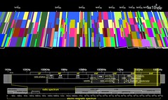
There were several works that might feed into our retired “Revealing the Invisible” theme. One that may prove particularly interesting for our thinking about radio frequency spectrum analysis was Seung-Yong Jung’s plots trying to visualize radio broadcasts across the UK showing broadcast strength and station popularity.

Seung-Yong Jung - Radio Frequency - UK Map on Tim's flickr

Seung-Yong also had some intriguing radial prints where each row of pixels was printed on a different concentric clear disk so that if one turned the disks the letters emerged and faded from legibility.

Seung-Yong Jung - Experimental Typography - Legible & Illegible Typo Using Numerous Dots on Tim's flickr

But my favourite work of revealing was from one of the Ceramics BA students, Judit Kollo. Judit had produced a wall hanging, built from textured slabs of porcelain. They looked good just as an abstract, their texture almost like a relief map.

Judit Kollo - Beauty and the Danger (light off) on Tim's flickr

But when you turned on the light behind them not only was the difference in thickness between different parts of the tiles revealed, but Judit had also drawn jellyfish on the reverse by pushing pinpricks almost through. Two of them are just about visible in this photo.

Judit Kollo - Beauty and the Danger (light on) on Tim's flickr


The book visualizations were interesting. One of the things Linda and I have been grappling with is how to make the visualization free-standing i.e. how do you include enough information in the design and in the key so that people can start to decode the visualization without needing the designer to explain it or without needing to read a manual. I’m not sure the ones I saw managed, though they were great in other ways.

Laura Sulivan‘s was an interesting series trying to analyse texts from the perspective of the visual principles of information design.

Laura Sullivan - Mapping Invisible Space and Evelin's embroidery beyond on Tim's flickr

I was lucky enough to be there when Ebany Spencer presented her project to the current first years. Ebany had several visualizations of the story “Flatlands” which I knew as it’s a popular short story among mathematicians. There were several innovations in Ebany’s work. She’d used a stave-like notation where each stave represented a different world in the book. She’d also printed each stave as a foldout hardback book with slots cut in the top and bottom of the pages into which the other stave-books slotted. I also loved the way she’d folded out the paper to produce some 3D in her visualization.

Ebany Spencer -  Flatland Notation System - Closeup on Tim's flickr

Ebany also had a different goal for her work and a new inspiration from the other book visualizations I’ve encountered. One of her goals was to take a strong editorial role: she seemed not to just want to reveal new things about the structures in the Flatlands story, but also to use those structures to tell a story about the work. Taking inspiration from the marginalia of medaeval illuminated manuscripts was also interesting.


There were several other works in which paper was physically manipulated. Haein Song made “Books of the Absurd” where he attempted to “attain a sense of futility, whilst being immersed in a love of creation”.

Haein Song - Books of the Absurd - DoF on Tim's flickr

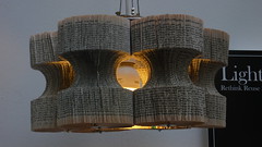
In form, though not in motivation, Haein’s work reminded me of Lucy Norma‘s recycled book lightshades that Richard and I saw during last year’s New Designers.

Lucy Norman - book lightshade on Tim's flickr

Cutting at paper also figured in some designers projects. Daniela Silva used cut-outs to physically map the interior of the homes she’s lived in.

Daniela Silva - Home Project - Cut-out Book Sculpture on Tim's flickr

And Aysegul Turan’s All That Is Solid Melts Into Air was a more abstract look at change through cutting or rubbing through paper (which was also covered in patterns of ink or ash?)

Aysegul Turan - All That Is Solid Melts Into Air - Books and Magnifying Glass on Tim's flickr


Recycling and the environment received less attention than last year. I’m pleased about that, it’s an important subject but was receiving so much attention from young designers last year that it began to get repetitive. There were still some nice pieces, like Angela Morelli’s maps of global water usage.

Angela Morelli - The Global Water Footprint of Humanity on Tim's flickr


Another theme from last year’s shows that had dwindled this year was CCTV. I did see one piece, by Joan Ayguadé Jarque on the BA in Product Design. He’d made a CCTV housing that subtly told people where it was looking, and provided a domed mirror so that people stood underneath it could use it for their own surveillance work.

Joan Ayguadé Jarque - Personal Surveillance on Tim's flickr


There were two projects that might be of interest to those studying family collections of media. In one designer Sarah Roesink asked her parents to write down personal memories associated with particular photos and then she made them into elegant bound book. Sarah was on the photography side of the course but I thought her response to the need to individually honour old family memories and photographs was something for us to chew on.

Sarah Roesink - Family Album on Tim's flickr

From the opposite perspective Mayuko Sakisaka on the product design BA made a piece called Please keep my secrets, a secure (and beautiful) printer for printing and storing text messages from one’s boyfriend.

Mayuko Sakisaka - Please keep my secrets on Tim's flickr

Storytelling was picked up again Aris Tsoutsas in his project On The Riverside. But this was almost the opposite of a digital project – the cover sheet was rendered onto a large sheet of rusty iron!

Aris Tsoutsas - On The Riverside - Ironwork on Tim's flickr


At the MA in Communications Design I was hoping to see more ‘physical computing’ than I did. That said the two projects that I did see with a strong ‘craft’ bent were two of my favourites of the whole day. In “Printed Matter” Evelin Kasikov had embroidered fonts and other design experiments onto card with cross-stitch. She had letters, colour charts, and pixelated phrases. The result was a wonderful evocation of the contrast between the digital and the slower crafts.

Evelin Kasikov - Printed Matter - Embroidered pixelated font on Tim's flickr

Robert Corish‘s “Audio & Visual Evolution” reminded me of several of our projects and was a real explosion of creativity. He had straightforward explorations of randomness that Tuck would have enjoyed

Robert Corish - Audio & Visual Evolution - Random repetition study 999 points 19 colours on Tim's flickr

But at the heart of the project were two machines for generating abstract sound feedback loops. He’d used MaxMSP, Arduinos and a host of other stuff to great effect.

Robert Corish - Audio & Visual Evolution - whole set-up on Tim's flickr

Robert was one of the few designers to include his commonplace book (or lab notebook, or day book, or whatever you call the notebooks we carry around) as part of his display and you can see why. His notes reminded me of Stuart’s or Richard’s, in fact he’s included his on his website, hinting towards the work Richard has done with his.

Robert Corish - Audio & Visual Evolution - Notebooks on Tim's flickr


There was so much more I could write about. Definitely worth a visit next year. One project it would be awful to sign off without mentioning was Kacper Hamilton’s Deadly Glasses. Kacper made a wine glass to represent each of the deadly sins, for example the one on sloth had a tap on the bottom and a hanging chain so one could hang it up and lie under it to drink the huge glass, drop by drop. Lust had a frosted glass ball at the end of the hollow stem so that one could drink by licking the base of the glass. Very clever and beautifully executed.

Kacper Hamilton - Deadly Glasses on Tim's flickr

Transparent Wikipedia visualization

14/05/08

At the coffee machine the other day I was talking to John Winn about my forthcoming intern project with Linda Becker, and about the new word tree visualization on Many Eyes that I found. Fernanda Viegas and Martin Wattenburg gave a riveting PARC talk about Many Eyes which I picked up from Andrew‘s post on his Information Aesthetics blog. In it they mention the surprising (to them) number of text based data sets (e.g. Shakespeare plays) which were uploaded to Many Eyes. But Many Eyes only had one simple text visualization – the tag cloud; so Fernanda and Martin locked themselves away for a week and brainstormed hundreds of text visualizations. Then their team implemented the best one of them, the word tree. I do like the text tree, here’s how it is described on the Many Eyes site:

A word tree is a visual search tool for unstructured text, such as a book, article, speech or poem. It lets you pick a word or phrase and shows you all the different contexts in which it appears. The contexts are arranged in a tree-like branching structure to reveal recurrent themes and phrases.

Martin gives a number of examples of its use on Many Eyes, from political speeches, through literary texts, to a funny example of the text people use in lonely hearts ads:

Back to the subject of this post. John wasn’t familiar with Fernanda’s work visualizing the history of Wikipedia articles. So I explained History Flow, the 2003/2004 work building visualizations like this one to show the build up of different authors’ edits of a Wikipedia article. History Flow is written up in a brilliant CHI paper that shows just how much Wikipedia behaviour can be gleaned from studying these diagrams.

But the diagram, the visualization, is separate from the page itself. One couldn’t stare at the diagram and thus read the source article. It turns out that John had done his own visualization of Wikipedia pages. John reasoned that edits to a page can be thought of as a quality metric, i.e. a piece of text that survives multiple edits is likely to be of reasonable quality. Here’s that example of John’s idea again:

John describes the idea on his Wikipedia user page : the age of the text is reflected by its colour so that standard text is over two years old whereas text that is only ten minutes old is rendered on a red background. I’m not sure this is the best way to do it – the red colouring both draws attention to the new text and also makes it harder to read, but there is something interesting about the data visualization not obstructing one’s reading of the source article.

Project idea: visualizing radio frequency whitespace with ferrofluids

24/04/08


Old seeping oil
by dumbledad

A few years ago we did some interesting work on using part of the DAB radio network in the UK for datacasting – i.e. for sending non radio content like video files or emergency procedures to mobile devices. Several of the people involved in that project have gone on to think hard about whitespaces i.e. what can we enable in the areas of the radio-frequency spectrum that are unlicensed or unused. Recently Gary Tonge and Pierre de Vries wrote a piece for Communications & Strategies (no. 67, 3rd quarter 2007) called “The Role of Licence-Exemption in Spectrum Reform”

Motivating countries to allow licence exempt spectrum is a difficult but an important debate. The difficulty is that the argument rests on the idea that licence exempt spectrum will encourage innovation, and unexpected successes (like wi-fi) will flourish. Of course it is hard to map out the unexpected.

Another problem is that people’s understanding of radio spectrum use and its actual use differs. Consider these two interesting visualizations of radio frequency.

First off I picked up http://spectrumatlas.org/ by http://www.bestiario.org/ from Richard’s trends blog. It’s a 3d visualization of the RF spectrum, an atlas of electromagnetic space. Using it you are left with the impression that the RF spectrum is jam packed with legitimate and useful services. So let’s instead look at a radio frequency spectrogram that I first encountered in an earlier paper by Gary Tonge. It’s taken from an Ofcom consultation document in their 2004/2005 spectrum framework review: “Spectrum Framework Review: A consultation on Ofcom’s views as to how radio spectrum should be managed

The key may be difficult to read, but the blue parts of the graph are spectrum not in use at the time the frequency was scanned. This scan was done over a twenty four hour period in Baldock (near where I live) in 2004. It tells a very different story form the previous visualization.

The Ofcom spectrogram is a very clear way to see how much of the radio frequency spectrum was not being used during that day. I’ve been wondering if this might be a fun thing to visualize using ferrofluids – hence the oily picture at the top of this post. Some of the more hardware savvy people in our team at work have been starting to think about ferrofluids and I’ve been on the look out for an application. One magical thing about ferrofluids is that they make something invisible shockingly visible. Normally they just look like oil but when a magnet is held underneath they adopt physical shapes dependent on the magnetic field. There are some awesome videos on YouTube and some lovely photos on flickr like this one from David Nicholai:

So perhaps this could be used to visualise the invisible radio frequency spectrum. I imagine using a small pump, beam, and sump to produce a sheet of oily ferrofluid over a sheet of plastic or glass. Behind the glass we could use Phidgets or an Arduino to drive magnets mounted on a motorised linear potentiometer. This would then result in elements of the graph being rendered as lumps in the otherwise sheer sheet of oil, which I imagine would look amazing. Interesting? Mad? Comments please.

Two new book visualizations

14/04/08

Since my recent post on work providing abstract computer rendered visualizations of biblical texts I’ve noticed are two more book visualizations, though this time neither are done on the bible. I came across them both in Andrew Vande Moere‘s amazing Information Aesthetics blog.

The first is Stefanie Posavec‘s On The Map, now showing as part of the On The Map exhibition at Sheffield’s Millennium Galleries. Stefanie’s visualizations are discussed and photographed on http://www.notcot.com/archives/2008/04/stefanie_posave.php and look very beautiful. Like Linda Becker she is a graduate of Central Saint Martins – they are clearly covering some fascinating stuff there. The sentence drawing are amazing and I cannot wait to get up to Sheffield and see them in full size and work out how they are constructed and how to read them. I should really have used one of the great photos of Stephanie’s visualizations on NOTCOT but I choose instead their picture of her copy of On The Road since that really shows the painstaking work that must have gone into this, and hints that she did the work through detailed reading rather than computer based statistical analysis (though that cannot be true).

The second is by Tim Walter and I think it forms his diploma project (I’m not sure how that maps on to the education system in England or the USA). It’s called Textour and as an example text Tim renders President Bush’s speech announcing the war against Iraq. There are similarities with the visualizations I mentioned before (especially with TextArc) but one thing Tim does very differently is that his visualization really does rely on animation. The still shots on his site are interesting – but you need to watch through the video to get a sense of how it works.

I’m getting excited about Linda Becker‘s forthcoming internship with me at Microsoft Research in Cambridge – this niche field of book visualization seems to be one that is generating more and more examples of interesting projects.

Bible Visualizations

17/03/08

A while ago Anab posted about the Institute for the Future of the Book, which lead to a discussion of information visualizations of book texts. One book that receives repeated attention is The Bible. This interest stems in part from the religious nature of the book itself (i.e. believers and academics are keen to gain new perspectives and new study aides), and in part from the ready availability of multiple versions of the text (e.g. through The Online Parallel Bible Project or The Bible Gateway). Over the years I’ve come across a number of inspiring abstract visualizations of the Bible, for example:

Anh Dang's 'Gospel Spectum' example
Anh Dang’s "Gospel Spectum"

 Kushal Dave's 'exegesis' example
Kushal Dave’s "exegesis"

Linda Becker’s 'In Translation' example
Linda Becker’s ‘In Translation’

Philipp Steinweber and Andreas Koller's 'Similar Diversity' example
Philipp Steinweber and Andreas Koller’s "Similar Diversity"

Recently two more have popped up on Andrew Vande Moere’s information aesthetics blog.

The first is old and not computer based. It’s Clarence Larkin’s "Dispensational Charts". Done over 75 years ago they map out various concepts by visually plotting the relevant biblical passages. E.g.:

Clarence Larkin's 'The Second Coming'
Clarence Larkin’s "Dispensational Charts"

The second gives rise to the picture heading this post. It’s Chris Harrison’s "Visualizing The Bible". Chris starts with an arc diagram plotting cross-references through the bible and then adds some network graphs of the people and places in the bible.

Bible cross references arc visualization
Chris Harrison’s "Visualizing The Bible"

Although Chris develops a visual aesthetic reminiscent of much of the work done with Processing he is in fact just using the Java 2D libraries.